 Quick Links
The Sprocket Quick Links web part brings frequently used pages, documents and websites together in one place. Use it to help people find resources such as an employee handbook, leave requests or IT support. Choose image cards, icon cards or compact tiles, then add and edit your links directly on the page.
Quick start
Watch the overview for an introduction to Quick Links, or follow the step-by-step setup instructions below.
Features
- Three layouts: Image, Icon and Compact.
- Optional descriptions and a shared call to action, such as Read More, in Image and Icon layouts.
- Upload your own images or icons, or choose from stock icons.
- Crop, rotate and flip card images, and set a focal point to keep the important area in view.
- Reorder and remove links using the controls on each selected card.
- Choose whether each link opens in a new browser tab.
- Show a web part title and panel independently.
Add Quick Links to a page
- Select Edit at the top right of your SharePoint page.
- Select the + icon where you want to add the web part.
- Search for Quick Links and select Quick Links - Sprocket 365.
- Select Configure in the sample display to create your first link. The configuration panel opens with the link's Contents settings.
- Enter a Title and Link URL, then add an optional description and image.
- Select Add link on the web part to create more links.
- Select Publish or Republish when your page is ready.
The initial cards are samples to demonstrate the layout. Select Configure to start adding your own links.
Choose a layout
Open the web part's configuration panel using its edit control. If a link card is selected, click an empty area within the web part to return to the overall Display settings.
| Layout | What it displays | Position options |
|---|---|---|
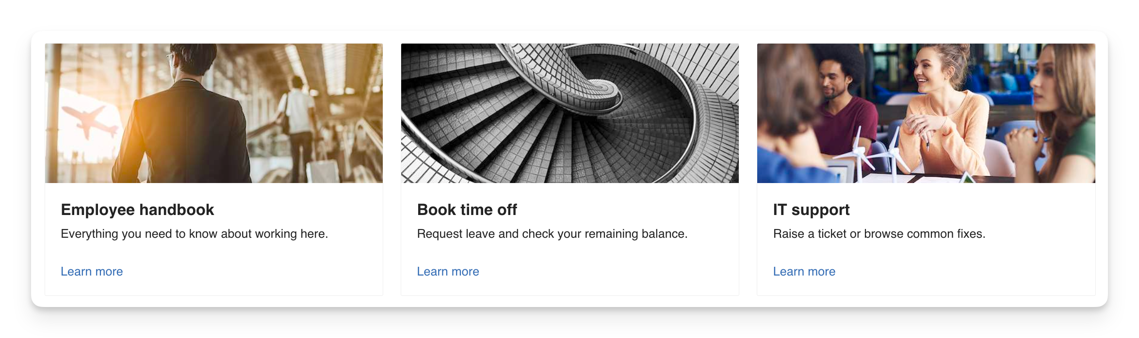
| Image | Cards with an image, title, optional description and call to action. This is the default layout. | Image at the Top or Left. |
| Icon | Cards with an icon, title, optional description and call to action. | Icon above the text. |
| Compact | Smaller tiles with an icon and title. Descriptions and calls to action are not displayed. | Icon at the Top or Left. |
Image layout
Icon layout
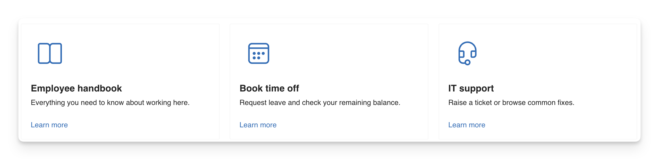
Compact layout

These layout previews use the web part's sample links.
Display settings
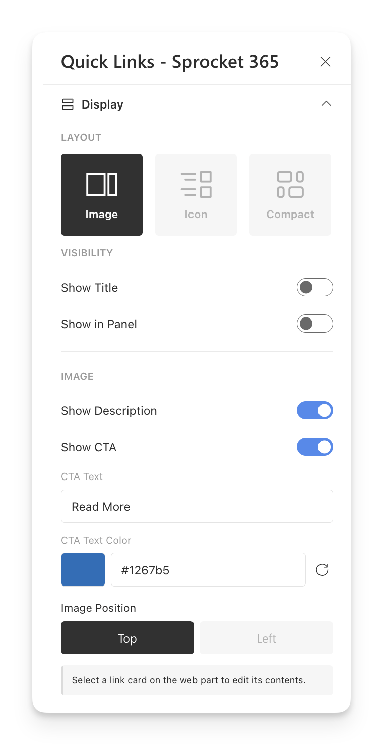
These settings apply to the whole web part. Select a card to edit its individual contents instead.
| Field | Description | Available in |
|---|---|---|
| Layout | Choose Image, Icon or Compact. | All layouts |
| Show Title | Display the web part heading. Enable it, then edit the heading directly on the page. Off by default. | All layouts |
| Show in Panel | Display the web part inside a styled panel. Off by default; the title can be shown with or without the panel. | All layouts |
| Show Description | Display each link's description, if one has been entered. On by default. | Image and Icon |
| Show CTA | Display a call to action on each card. On by default. | Image and Icon |
| CTA Text | Set the call to action used on all cards, up to 80 characters. Defaults to Read More. Appears when Show CTA is enabled. | Image and Icon |
| CTA Text Color | Choose the call to action text colour. Uses the site's theme colour by default. Appears when Show CTA is enabled. | Image and Icon |
| Image Position | Place the image at the Top or Left of the card. Defaults to Top. | Image |
| Icon Position | Place the icon at the Top or Left of the tile. Defaults to Top. | Compact |
The whole card opens the link. Hiding the call to action does not stop the card from being clickable.
Add and edit links
While the page is in edit mode, select Add link to create a link, or select an existing card to change it. The Display section switches to the selected card's settings.
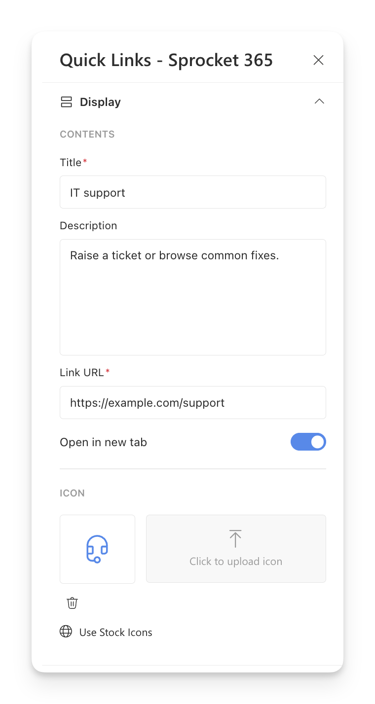
The example uses a placeholder URL. Enter your own destination in Link URL.
| Field | Description |
|---|---|
| Title | Required. Enter the text shown on the card, up to 80 characters. |
| Description | Optional. Add supporting text, up to 300 characters. Available in Image and Icon layouts; enable Show Description to display it. |
| Link URL | Required. Enter the address of the page, document or website to open. |
| Open in new tab | Open this link in a new browser tab. On by default for new links. Turn it off to open the link in the current tab. |
| Image | Upload an image for the card. Available in Image layout. |
| Icon | Upload an icon image or select Use Stock Icons to choose an icon. Available in Icon and Compact layouts. |
A card must have both a Title and a Link URL to appear to readers. Incomplete cards show a warning in edit mode and are hidden on the published page.
Add or adjust an image
- Choose the Image layout, then select a card.
- Under Image, select Click to upload image and choose a file.
- Use Edit image to crop, rotate or flip the image. Saving creates an edited copy and keeps the original in Site Assets.
- Use Set focal point to choose the area that should stay in view when the image is fitted to the card.
- Use Reset focal point to return to the centre, or Restore original image to undo saved image edits when that option is available.
To replace an image, upload another file. Use Remove image to clear it from the card.
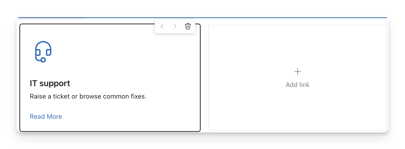
Reorder or remove links
- Select a card while the page is in edit mode.
- Use Move left or Move right on the card's toolbar to change its position in the collection.
- Use Delete link to remove the selected card.
- Select Publish or Republish to make your changes available to readers.
Styles
The Styles section provides optional settings for authors who need custom styling.
| Field | Description |
|---|---|
| Custom Styles | Add custom CSS for the web part. |
| Custom CSS Class | Add a CSS class to the web part's root element. |
FAQs
Why do I see link settings instead of the layout options?
A card is selected. Click an empty area within the web part to deselect it and return to the overall Display settings.
Why is a link missing from the published page?
Check that the card has both a Title and a Link URL, then republish the page. Cards missing either field are visible only while editing.
Why does clicking a card select it instead of opening the link?
In edit mode, clicking a card opens its settings. View the published page to follow the link.
Can each card have different call to action text?
The CTA Text setting applies to all cards in the web part. Each card has its own title, description and destination URL.
Where are the links managed?
Add and maintain links directly in the web part while editing the page. No separate SharePoint list is needed.